Fresh eyes and a dual-track approach create a 3-year vision and £14m
+15%
A 15% conversion uplift in completed applications.
£14m
Increase in annual revenue based on the A/B test data.
+40%
Huge efficiency gains for designers and developers
Zego
Company
6 months
Timeframe
Fintech
Industry
Design lead
Role
3 designers
Team
The on-demand insurance scaleup had the ambition to scale, but their product experience was fractured. Fleet customers called support when quote flows led nowhere. Users juggled apps. Design and engineering teams rebuilt the same components in different ways. We spent 6 months showing Zego a future they couldn't see, and built the design system to make it real.
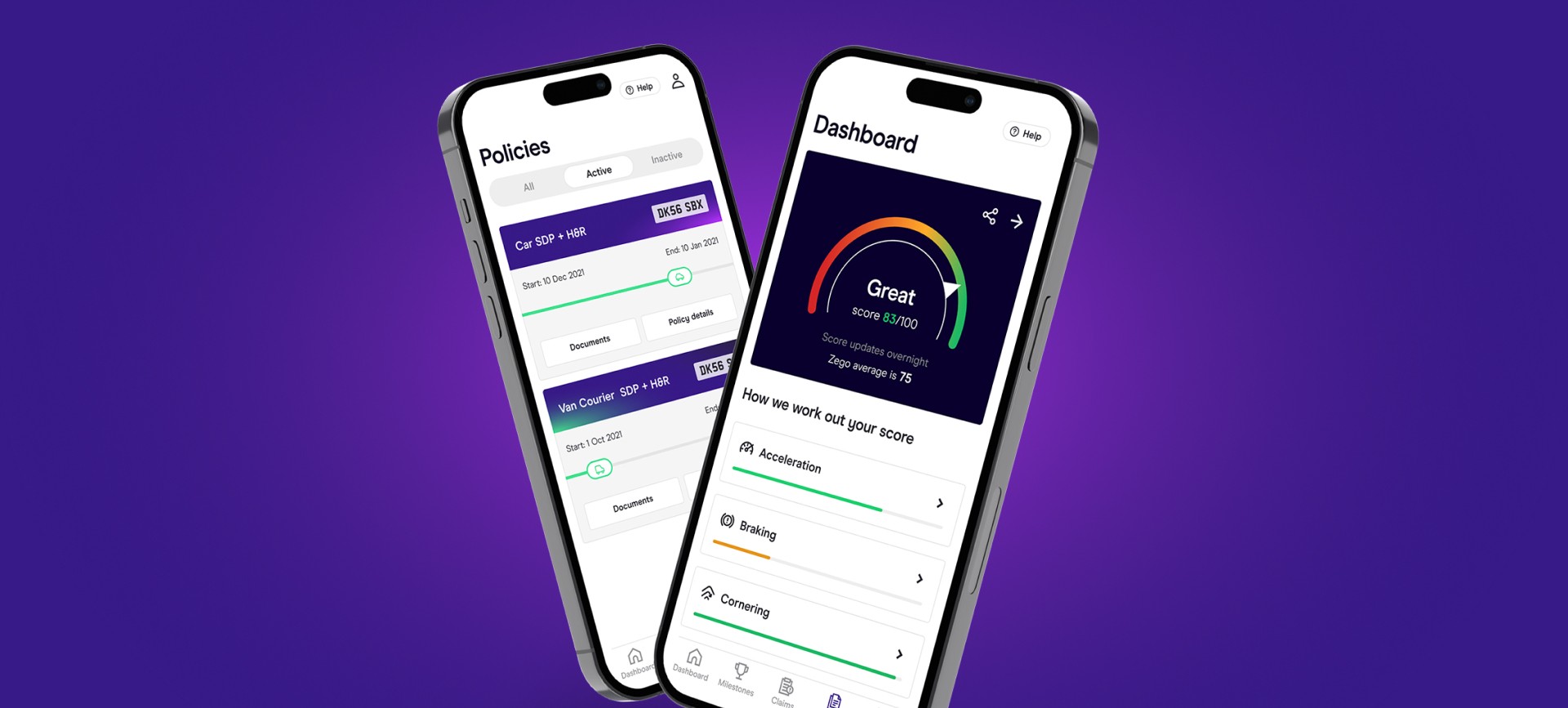
Zego's policy manager and telematics dashboard
Fragmented apps, dead-end flows, and frustrated users
Zego's growth story looked great from the outside. Partnerships with major gig economy platforms. Expanding from cars to scooters to vans. But inside, the cracks were showing.
Their apps were built in silos. Separate experiences for single vehicles versus fleets. Different UI/UX across app and web, even separate apps to use a single product. Fleet customers would start a quote flow only to hit a dead end, forcing them to call customer service. It wasn't just frustrating for users; it was expensive for Zego.
The team knew something was wrong, but they were too close to see the full picture. They needed outside eyes.
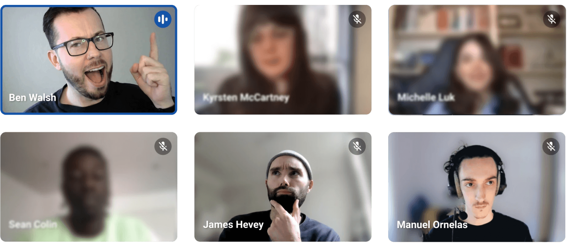
A live workshop with the Sense app team
Discovery through workshops and stakeholder interviews
That's where we came in. We started by getting our hands dirty. Using live products, clicking through flows, documenting inconsistencies, and "playing customer".
We asked Head of Design Benny Zuffolini the questions they hadn't had time to ask themselves. Why do these flows diverge? What happens when a scooter driver becomes a van driver? Where does the experience actually break?
Then came the workshops. We brought together stakeholders from across the business. Customer service, product managers, engineers, and the design team.
One insight kept surfacing
They were wrestling with an exponentially complex decision tree. Every new partnership and product multiplied the possible paths through their system.
Building a north star vision and design system in parallel
We made a decision that would shape the entire project: build two things in parallel.
A north star prototype
Showing Zego what their product could become. A complete redesign from website to app. Consolidating their fragmented experiences into a single, unified journey. One that worked for any user, fleet operator, or independent courier.
An atomic Figma design system
The foundation that would let Zego's team actually build that future efficiently. A comprehensive toolkit of components, patterns, and documentation.
Most teams pick one or the other. We knew Zego needed both, and we could deliver them working side-by-side with their team.
Design system documentation sample
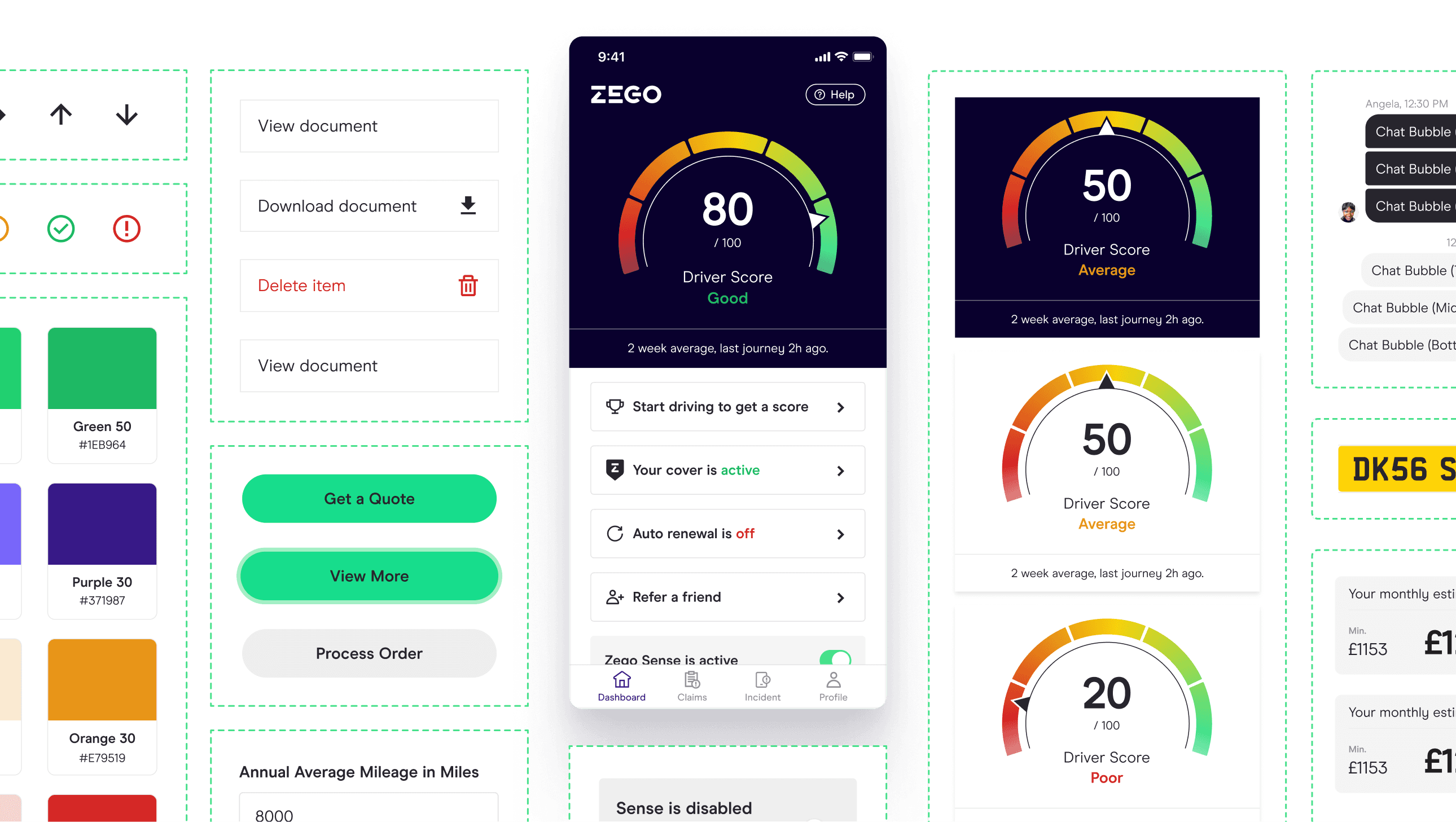
Figma design system components
Creating a quote flow that works for every user type - our biggest challenge
Coordinating detailed feedback from internal teams. Compliance requirements, technical constraints, business rules, and actual customer pain points. We created a design that was more than clean UI and microcopy.
We mapped every decision point, every conditional branch, every edge case. Then we translated that complexity into something that felt simple. A conversational flow that asked the right questions at the right time. Guiding users through a process that hides the complexity under the hood.
The goal: no more dead ends. No more confused calls to support. Just a clear path from "I need insurance" to "I'm covered."
Quote user flow samples
Side-by-side collaboration delivered results first time
We didn't design in isolation and throw files over the wall. We sat alongside Zego's designers and engineers throughout the project. Daily collaboration, constant feedback loops, shared Figma files. When we designed a component, their engineers could see it taking shape. When they had questions about implementation, we were right there to answer them.
Working side-by-side meant we delivered the right thing first time, every time. No wasted sprints. No "wait, that's not what we meant" moments three weeks into development. Instead, steady progress toward the north star vision and the system to build it.
Zego sense app UI samples
Delivering three years of product roadmap
When we handed over the final work, the team saw the value immediately. "There's enough work here to keep us sustained for years." - Lead Product Designer Kyrsten McKartney.
The north star prototype gave them a tangible product roadmap. Every flow reimagined, every interaction considered, every screen designed. Three years of UX direction, ready to build.
The design system gave them the efficiency to actually ship it. Designers were now moving 40% faster. Engineers had clear implementation guidelines. New designers could onboard faster. The system became a shared language that let the whole team move in the same direction.
Most importantly, we'd introduced UX patterns and interactions that Zego hadn't considered. Fresh eyes see what's broken, and what's possible.
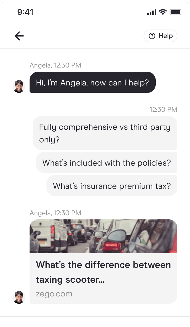
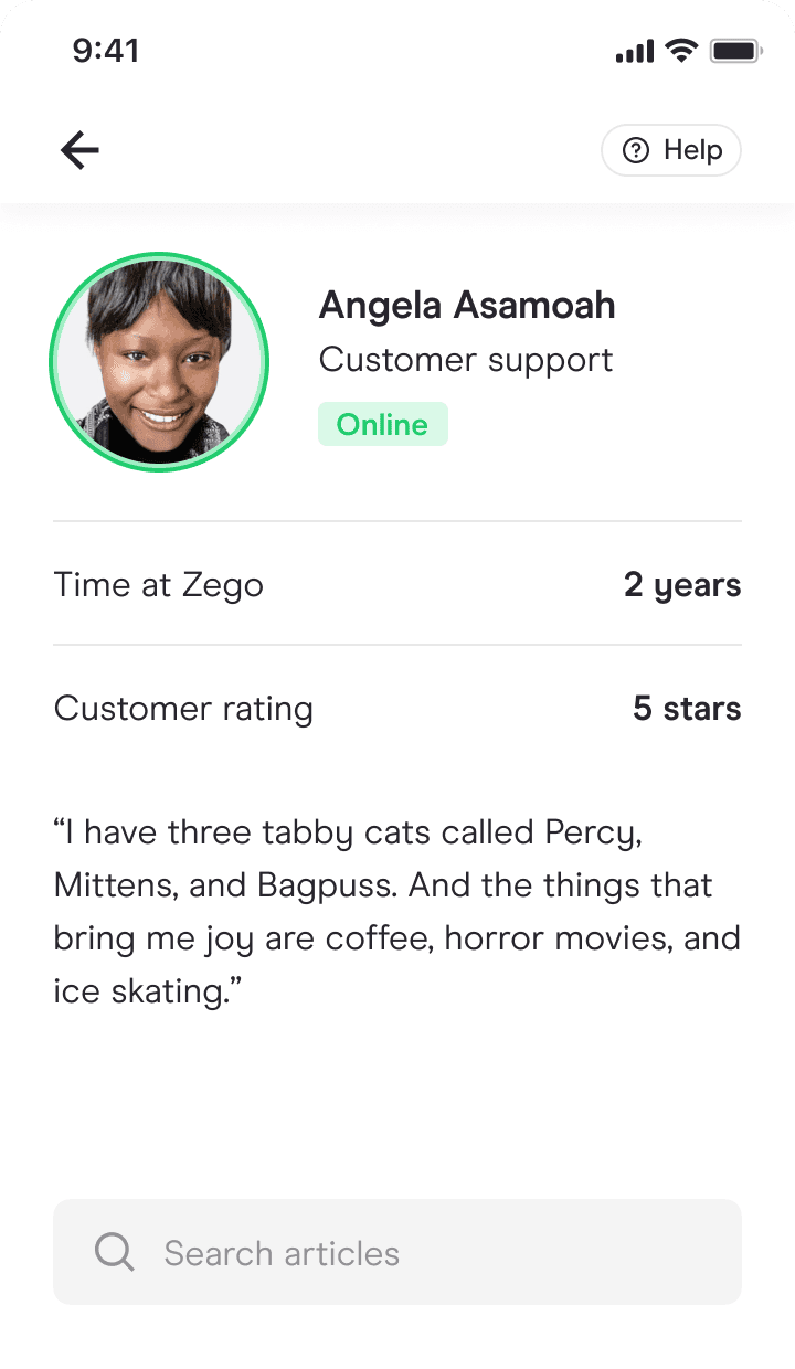
Customer support UI samples
A/B testing validated the approach
Toward the end of the project, the A/B test results started rolling in.
The new quote flow we'd agonised over, coordinated feedback on to get right, was converting 15% better than the old experience. Those dead-end flows that used to dump fleet customers onto customer service? Gone.
That 15% conversion uplift translated to £14 million in projected annual revenue. No clever growth hacks or aggressive marketing. Just making it easier for people to buy the right insurance.
It was validation of everything we'd bet on. Fresh perspective revealed opportunities, and investing in vision and infrastructure paid off.
A/B test results showing the 15% conversion uplift
Three lessons learned
Proximity blindness is real
When you're inside a system every day, you stop seeing it clearly. Sometimes, the most valuable thing an external team can offer is fresh eyes.
Vision without a plan is a pipe dream
The north star prototype showed what was possible. The design system infrastructure made it achievable. You need both.
Side-by-side beats handoffs. Every. Single. Time.
The extra coordination effort saves 10x the rework later, and the relationship you build becomes its own deliverable.
Want help designing your north star?
25m, friendly, no sales pitch
