11 shipped features later, the VP of Product called me their single best investment all year
+20%
Increase in data collector activations
2x
Increase in customer data insights for marketing and product
24
Research and data backed design concepts
Prolific
Company
14 months
Timeframe
AI
Industry
SaaS
Industry
Senior Product Designer
Role
I'll never forget sitting in Prolifics London office. Surrounded by people I'd worked with for months. Mid-meeting, Sara, the VP of Product, said something I didn't expect.
"Ben has been the single best ROI our team made all year."
I went beetroot red. I was a contractor. But in that moment, I felt like part of the team.
Here's how I got there. It started with a broken sign-up flow and a three-month contract. I didn't know the team would change. Or that our direction would shift. I ended up shipping work across growth, onboarding, AI tools, and more.
Here are 3 of the 24 projects I worked on.
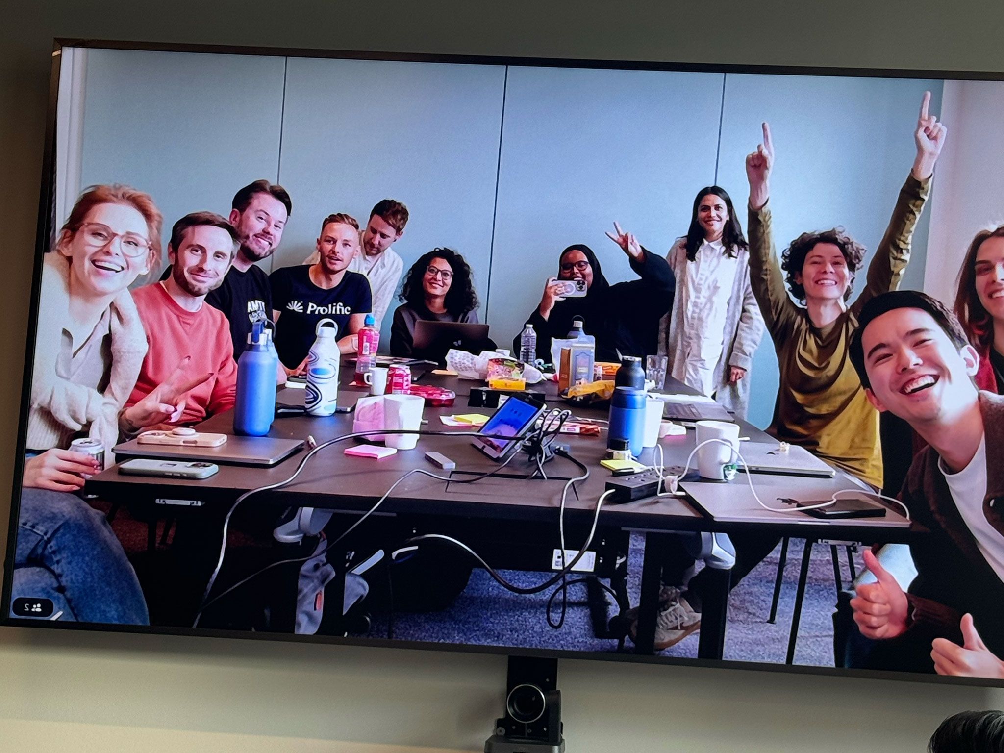
Photo from the data collector product group meetup


UI samples from across the projects I did at Prolific
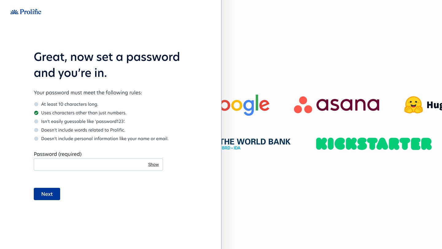
Fixing a registration flow that was hemorrhaging 50% of user data
When I joined the self-serve growth team, my first task looked simple. Cut the time it takes new data collectors to launch their first study. But when we dug into the data, we found a broken journey.
About half of new users skipped a step that gave us useful insights. The email verification step let them slip straight into the product. We also had the wrong people signing up. Prolific has two sides: data collectors (researchers) and participants. But both used the same login portal. Participants signed up as data collectors and couldn't fix it. Some thought they could cheat the system and skip the participant waitlist.
Marketing worried about making changes. But they were already losing the data they needed. Half of it leaked out through that email loophole.


Before
The old registration and getting started experience that lost 50% of all user data and was confusing users
I proposed a fix. Delay verification until after sign-up. Move the questions into the product. Ask, but don't force. Make them hard to miss. The "Get Started" screen became a gentle nudge, not a locked gate. Users could explore the product straight away. We added guidance for each step with clear reasons to complete it.
The results: 20% more conversions. Less time to first study. Marketing got better data. The product team got faster users. And users got in without feeling blocked.
After


The new registration has more pages and clicks, yet feels easier and converts 20% better


This is the first screen after sign-up. We let users explore the platform. We gathered data in the background. And we added tips to help them find their way.
Do they have the participants I need? How we answered one of the top 3 questions new users ask before launching a study
One of the bigger challenges was Participant Finder. A tool researchers use to find and select participants. The tools filtering system was powerful but suffered from a discoverability problem. Users had access to dozens of targeting options, like demographics. And access to premium features like verified domain experts.
The design challenge had three parts. Essential filters needed to be easy to find. Premium features needed visibility for their commercial value. And it had to show researchers whether we had the participants they needed.
Here's the craft decision I'm most proud of: I designed for portability from day one. It needed to work as a standalone tool. But it also needed to embed into the existing study setup flow.
I gave myself a guardrail: if I designed it right, it would drop into the existing UI later without a redesign. That constraint shaped every layout, component, and interaction pattern.


Participant finder
On the second iteration, we used AI to suggest and apply relevant filters from a description. Great for discoverability.
The result was a feature that helped new users find their audience. Without limiting power users. And it surfaced premium features without being pushy.
Shipping in 3 weeks, not 3 months, by designing less
Sometimes the best design work is knowing what not to build.
The strategic integrations team was working on Secure Studies. A way to help data collectors lock down their research with better security controls. Part of a collaboration with some of their biggest customers like Google and OpenAI. When I joined the talks, they had big plans: new UI pieces, new pages, and fresh user flows. Engineers were estimating months of work.
I proposed something different. What if we used existing design patterns and components we already had? What if we shipped an MVP version first. Learned in real-time. And then decided if a custom solution was even needed?
There was resistance at first. The team had spent time discussing their vision, and it felt like I was asking them to settle for less. But once we reframed it as "test first, then invest," they came around. The engineers realised they wouldn't need to write as much new code. They could focus on functionality instead.
We shipped the feature in three weeks instead of months. It wasn't a compromise. It was a faster path to validation.


Existing design patterns used in secure studies feature
Other stuff I worked on
Beyond the projects above, I worked on several other initiatives:


Projects. Helping users organise their projects folder by surfacing status counts, inline renaming and pinning. Especially useful for customers with lots of proejcts.


Dashboard. Creating visual cues as a to do list for users to show them what to do next. Great for improving communication and other study related metrics.
My beetroot face, and the moment that made it happen
Back to that London office. Back to Sara sitting in front of the entire product team, saying I'd been their best ROI of the year.
It caught me off guard. My face went red. The compliment was nice, but that's not what stayed with me. I felt seen. Not as a contractor drifting through. As one of the team. As someone who helped build something real.
Sara later said she'd rehire me in a heartbeat. Roop, product lead, praised how fast I grasped complex work and brought the team along in my thinking. Engineers valued my technical knowledge and adjusted designs without hurting the experience. Junior designers said they learned from watching me.
Those words matter to me. But that moment in London matters more. It proved what I needed to know: you can create real value amid chaos. And you can be a contractor and still be part of the team.
What I learned during my time at Prolific
Prolific renewed my contract like clockwork. Each time, I said yes because they wanted me to stay. But in that time, I worked with four different product managers. Each change meant starting over. I had to rebuild trust. Sometimes I watched good work get set aside when priorities shifted.
We had a polished refer-a-friend system ready to go. It got deprioritised. We designed a customer satisfaction feature to capture sentiment at key journey points. It never shipped.
When the org chart changes, you must adapt
It's how you stay useful. I learned to get up to speed fast, earn trust with new people, and keep delivering even when my team changed around me.
Contractors earn trust one job at a time
Full-time workers build bonds over years. Contractors start from scratch with each contract. I prove myself through solid work, clear ideas, and a willingness to adapt when goals change.
Restraint in design deserves more credit
Knowing when to reuse existing patterns is as valuable as designing something new. Speed matters. Learning matters. Sometimes a quick build with existing parts beats a custom solution.
My time at Prolific wasn't exactly what I'd expected. It was messier, longer, and more chaotic. But it was also some of the most fun and valuable work I've done, and Sara's comment in that London office proved it.
Want help designing your product?
25m, friendly, no sales pitch