
Delicately building a design system supporting 1k+ products, only to watch it get put on ice
46
Product leaders, designers, and developers
1,000
Products to align brand and consistency
70%
Solution adoption across the organisation
Pearson
Company
12 months
Timeframe
Edtech
Industry
Design lead
Role
6 designers
Team
I spent six months building a design system for several international product teams. Each team had different needs. Each had reached a different stage of adopting our global rebrand. We built trust. We ran demos. We coached people. We got buy-in. Then, weeks before the project ended, a new Head of UX arrived and cancelled it.
Pearson needed help rolling out a major rebrand to their products
After spending the previous 6 months building an ecom design system for Pearson. The head of product asked us to do something similar for their products.
We needed to work with the brand team. Together, we'd create a system of accessible UX design patterns with some flair. Their products include learning platforms for kids, university assessments, and corporate training software. None shared a foundation. Each product looked like it belonged to a different company. This made sense, though. Pearson had acquired most of them.


Pearsons updated branding samples
This was the first time many of the teams had met, let alone worked together
Most of Pearson's products have their own team. We worked with 10 of these teams across eight time zones. This meant a few late nights and early mornings.
We created shared channels and meetings so everyone could see our work. Many of the teams had never met before. Some had never worked together. We encouraged open discussion and teamwork.
For weeks, we studied how each team managed their design process. Some teams had a handful of components in Figma. Others had static files. A few had well-structured design systems.
We audited their design files for structure, naming conventions, and components. We hosted alignment sessions with them.
Each team had built something useful for their specific context. We wanted to respect that.
The real challenge wasn't technical. It was human.
Our recommendation was to build a centralised design system. Like Google material. And a cross-team governance process.
This let designers use brand-approved colours in their own files. The colours made it obvious where to apply them. It also provided pre-designed components where products shared a common UX pattern. All without removing too much creative freedom and control from teams.
Not everyone was open to our proposed changes
Shocking, I know, not everyone was open to our proposed changes. And every designer had some pretty strong opinions on what a new system should look like. It was going to be hard work to get the buy-in we needed.


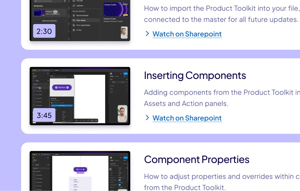


Snippets of the well documented design system
Showing teams how to use the system unlocked the buy-in breakthrough we needed
Early on, feedback came in dribs and drabs. Teams were more interested in getting access to the "finished" thing. But they didn't have full access to use it and drop feedback yet.
Our variables stole naming conventions from Material UI. Surface and on-surface pairings for reliable accessible colour combinations.
Patterns that millions of designers and developers already understood. We built light and dark mode theme support with careful aliasing. This let teams map the new system to their existing tokens. Teams could adopt the toolkit without breaking their current workflows.
Our breakthrough came when we spent time with Katie Dove, lead product designer. Once she understood the concepts, she stopped thinking about the system. She thought about her users instead. The toolkit had become part of her workflow. Good infrastructure should do this.
Then the Fredly team had their breakthrough. They mapped our variables into their own theme layer. Now they could switch between light and dark mode straight away. Some teams had never had dark mode. Some had no design system at all. Now they had both.
One by one, teams started to get it. They committed to use the toolkit. They also committed to contribute to it.
We built something flexible, not rigid. This started conversations that helped us refine the system for weeks.

Why the project got put on ice
After four months of progress, our main stakeholder changed. They brought fresh priorities and a new vision for where design investment should go.
We got dragged into an internal conflict. We had to defend the ROI of our solution in some intense meetings. We spent more time defending the work than doing it.
But the metrics and feedback supported our work and decisions. 70% of teams had integrated with the system. Designers moved faster. Accessibility issues were gone. Brand consistency was growing.
Despite the facts, they chose to invest in "brandable moments". They wanted animations and characters that looked impressive in executive presentations. Design infrastructure is a hard sell to those who don't understand it, no matter how valuable it is.
Six weeks before our planned completion, the project ended. The remaining budget moved elsewhere.
Teaching pal product before and after
Product UI example for the Nemo team based in the UK
So did we build the right thing?
By the time the project ended, we'd delivered the core system. Teams had it. They were using it. They'd seen how it made their work better. They didn't need us anymore.
70% of teams had added the toolkit to their workflows. The remaining 30% weren't against it. They were further along in their product cycles. But everyone could now meet the first goals. Update product colours and logos by end of year, even if they couldn't integrate it all.
We set out to create a central design system. What we did was spark a design collaboration movement at Pearson.
Internal politics meant what the business wanted changed. That was out of our control. An adoption rate of about 70% lets me say with confidence: yes, we built the right thing.
What I learned
Don't be too precious, plan your exit from the start
We made teams feel heard. We respected their existing work. We gave them a system that solved real problems. So when the project ended early, those teams stepped in. It was theirs. A consulting role is short-lived. So it's important to partner with the people who'll maintain the project as soon as possible.
Stakeholders can kill the right solution
We measured success by adoption, efficiency, and team autonomy. At the end, leadership changed their mind. They moved from "brand alignment" to "brandable moments". This doesn't affect the quality or success of our solution for the original goal.
Want help building your design system?
25m, friendly, no sales pitch
