
Cutting time on task by about 30% for a facilities management company
Supplier registration and an engineer app for Cloudfm, then the asset dashboard that was meant to follow them.
Industry
Facilities management
Role
Lead Product Designer
Team
Product owner, engineers, a UI designer and me
Cloudfm wanted an Uber-style model for facilities management, but it lost sight of its engineers in the field
Cloudfm is a facilities management company that was moving towards an Uber-style model. That took connected technology linking service providers to the facilities that need maintenance, for both scheduled and ad hoc work, with an engineer app playing the part of Uber’s driver app. How well engineers work in the field makes or breaks service level agreements (SLAs), and the costs of Cloudfm and its service partners.
The job itself was where this fell down. A task went from the client to the helpdesk, then to a supplier, then to an engineer. From there, Cloudfm lost all visibility until the engineer reached the site. Engineers then had to check in by scanning a QR code or phoning, and their risk assessment and method statement (RAMS) documents sat outside the app as PDFs.
Joining the network was a problem too. Suppliers registered through intrusive forms, and Cloudfm’s own team ended up uploading insurance documents and chasing certificates for them.
The work was for suppliers registering with Cloudfm and the engineers they send to sites
Cloudfm chose to start with its existing supply chain partners. That meant the people at a supplier filling in the registration, and the engineers taking jobs on their phones.

A new task, with photos up front and an arrive-by hint
I ran discovery and workshops, then designed the engineer app’s UX and the registration flow
Discovery took two weeks: 1:1 interviews, then a group workshop. We rewrote problem statements as How Might We questions, ideated and dot voted. I ran supply chain interviews and journey mapping, and we prioritised 14 pain points. Stakeholders’ ideas shaped the wireframes.
I also ran 4 sessions for 12 senior stakeholders on discovery, agile collaboration and critique.
I came in through YLD, working with Cloudfm’s product owner and engineers. Another designer handled the UI and components.
A conference prototype came before the build, and time ran out before certifications and RAMS in the app
We aimed at a clickable wireframe and a high-fidelity prototype for Cloudfm’s supply chain conference, which would also help the engineers building it. We knew the real thing wouldn’t be ready in time, so the prototype came first.
Certifications and RAMS in the engineer app were stretch goals, and they never got done, with no design work or research on either. With the time we had left, we ideated and created as much as we could.

Registration: Companies House first, then disciplines and documents, in six steps
I reordered what suppliers face and designed a way to see a job before the engineer arrives
I started registration from Companies House and ran it in six steps, because the old portal showed 12 sections at once
The old portal listed 12 sections down the side, with a completion ring, so the whole load sat in front of a supplier from the first screen.

The old portal, left, and the same insurance step redesigned, right
The form still had to collect insurance, modern slavery, GDPR, health and safety, environment, accreditations and RAMS documents. So the design job was order. A Companies House quickstart comes first, then disciplines from a searchable list, then documents section by section.
This flow was built. The lesson I took is that when a form can’t ask for less, you can still choose what people meet first.
I asked engineers one question before they set off, because Cloudfm couldn’t see a job until they arrived
We took inspiration from Uber and other gig economy services. A new task gives the engineer Accept, or More Options to reject with a reason. Being able to say no wasn’t how tasks were allocated at the time, so I also drew a version the engineer can’t reject.
The reminder goes straight at that blind stretch: “are you on track to leave in 30 minutes?”. If not, the engineer gives a new estimate and the client is told. My notes also say this wouldn’t have to reach the client, because Cloudfm or the supplier’s admin team could use it to allocate someone else.
Messages put engineers, the site, the supplier’s admin team and Cloudfm in one group conversation, so Cloudfm isn’t the go-between and it all stays in the event log. Check-in was a requirement, by QR scan or phone call, and our thinking was to design that out with GPS and a push notification near the site.
The lesson I took is that a pattern borrowed from gig economy apps needs checking against who can actually say no.

On the job, after a task is accepted
UAT on core flows showed about 30% less time on task. The registration flow was built.
The registration flow was built. The engineer app went to the conference as a prototype and to the engineers as specs. In UAT, cutting steps per task took about 30% off time on task on core flows.
Two things I’d carry forward:
A stretch goal with no research behind it doesn’t get done when a date sets the pace.
A conference prototype gets people reacting before a build exists, and it puts the story ahead of what can be built by then. Everyone has to know which is which.
At the time, I worried about what bad ratings would do
I designed job and client ratings, and I wrote my concern down at the time: “when things go wrong, and bad ratings are left. Some of these engineers will be back onsite at some point and that could cause friction.”
I also asked: “when rating a site, do we rate a specific person or the site as a whole?”
Tools for managing assets were next on the roadmap
The engineer app keeps engineers connected to their jobs. Tools to help teams manage their assets were the next piece. I discussed them with Cloudfm at the time and here are three linked screens that take someone from 214 sites down to one freezer. The restaurant group and the numbers on the screens are sample data.

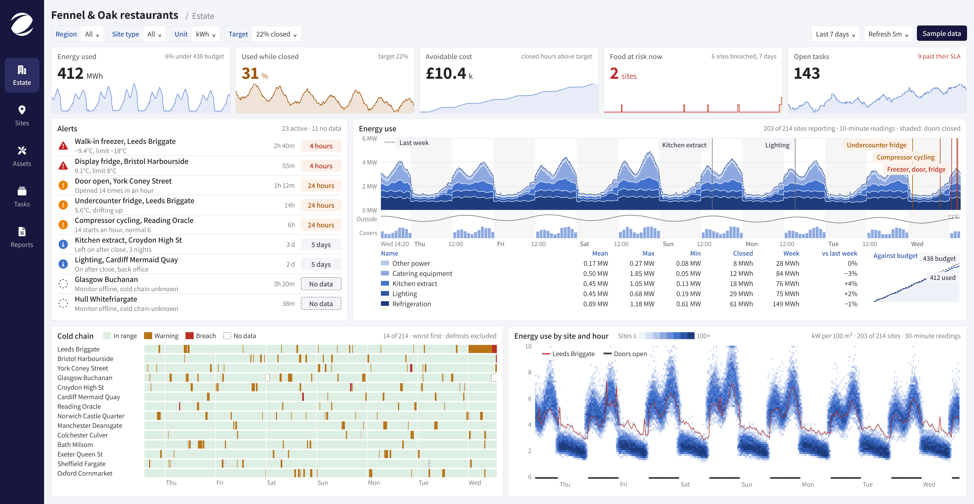
The estate view, with sample data
I asked what someone running 214 sites wants to see first
The starting point was Mindsett, Cloudfm’s live monitoring technology, which tracks facilities around the clock for power, water, maintenance and assets. Someone running a couple of hundred sites can’t check them one at a time, so I designed for that person, and the sample group has 214 sites.
I ranked sites by avoidable cost, because total energy only finds your biggest buildings
Being under budget can hide waste. The sample group is 6% under its energy budget, yet 31% of its energy runs while the doors are closed, against a 22% target. So the top strip puts both side by side.
Avoidable cost means closed-hours use above target, priced. That’s what the league table sorts by, and risk sits in the same row, because the person deciding where to send someone needs both. Leeds Briggate tops the list on cost and has a freezer failing.
Missing data never counts as zero. Glasgow’s monitor is offline, so its row says no data, its line goes dotted and its cold chain reads as unknown. Counted as zero, an offline site would look like the best one in the group. Status also uses a shape as well as a colour, so nobody has to rely on red and green alone.

The league table, ranked by avoidable cost, with sample data
One level down, the site view keeps the same measures, so you don’t relearn anything. Below that, the asset view follows a single freezer.

The site view, one level below the estate, with sample data

One freezer's temperature, compressor power and door openings on one clock, with sample data
I put temperature, compressor power and door openings on one clock, so the cause reads straight down the page
In the asset view, the compressor stops at 11:20 and the temperature climbs after it. You read that top to bottom without comparing two charts.
Defrost peaks go over the limit on purpose, so they don’t raise an alert. A plain threshold would cry wolf several times a day.
Energy data can also warn about a failure. This freezer was using 57 kWh a day against a group median of 34, so the view compares it with every other one in the group.
The task fills in from the readings, using Cloudfm’s own urgency tiers, and goes to the engineer app above as a new task. So an alert on this dashboard finishes where the engineer’s job starts.