The Best Figma Plugins for Accessibility Testing
Here's the problem. Figma does have a built-in contrast checker, but it's part of the colour picker. You open the picker, click the right pixel, then see if it's okay. And that's all you get, no help, no suggestions. Even for small components, this is painfully tedious. And when you're working with design systems containing dozens of components and variants, this manual process becomes a huge time sink.
This explains why the accessibility plugin ecosystem has flourished. Designers want to check contrast without leaving their canvas. The trouble is that some plugins are excellent, others are flat-out unusable. The 'market leader' had been paywalled up to its eyeballs. And a bunch haven't been updated in years.
So, I installed and tested every major contrast-checking plugin, documented which ones work reliably, and identified clear recommendations for different use cases. I've tracked update history, feature support, and pricing. I'm not affiliated with any plugin, though I am working on one of my own (more on that later). What follows is my honest assessment of what's worth your time.
TL;DR recommendations
Before we get into the details, here's what you should install based on your particular needs:
Use Case | Our Pick | Why |
|---|---|---|
Best Free Option | Contrast (WillowTree) | Actively maintained, and supports components and instances |
Best for Batch Checking | Stark is comprehensive but costly - Contrast will do most of your contrast checks for nothing | |
Best for Libraries or Design Systems | Component and instance support for checking across variants | |
Best Lightweight Checker | Able (Sondra Kim) | Simple and friction-free, though limited to a two-layer comparison |
Best APCA Support | Visual Contrast (NoWork) | A beautiful presentation of results helps users better understand the emerging standard |
Understanding colour contrast
Colour contrast measures the luminance difference between foreground and background colours, expressed as a ratio where higher numbers mean better contrast. People with low vision, colour blindness, or those viewing screens in bright sunlight all depend on sufficient contrast to perceive content.
The standard most organisations target, WCAG (Web Content Accessibility Guidelines) Level AA, requires 4.5:1 for normal text and 3:1 for large text. These thresholds are referenced by regulations, including the European Accessibility Act and the Americans with Disabilities Act.
How I tested the plugins
We installed each plugin fresh in January 2026 and tested against a standardised design file (Material UI 3 community) containing text layers with various contrast ratios, components, sections, instances, nested frames, and groups. The file included passing and failing contrast combinations, semi-transparent layers, and complex nested structures that often trip up automated tools.
For each plugin, we documented whether it launched without errors, accurately detected colours, supported Figma's component and section features, and offered any unique capabilities.
We also recorded the last update date from the Figma Community. A plugin that hasn't been updated in three or more years may work today, but risks breaking with future Figma releases. Figma's API evolves, features change, and unmaintained plugins eventually accumulate incompatibilities.
Features tracked
Feature | What It Means |
|---|---|
Bulk-check | Can you bulk-process checks or use it manually? |
Section, Component, Instance support | Works with Figma sections, components, and instances |
Shows contrast value | Shows an accurate contrast value |
Shows colours used | Shows colours used to calculate contrast value |
Opacity support | Accurately calculates colours with opacity |
Links to design | Provides a link to navigate to the failing part of the design |
Ignore fails | Let's you ignore a specific fail |
APCA support | Provides a way to use the APCA |
Type size checks | Uses text size to give you an accurate result |
Touch target size | Provides a way to test touch target sizes |
Vision simulation | Shows a preview of vision types |
Vision generator | Generates a preview of vision types on the canvas |
Automatic monitoring | Links your file to a central monitoring platform |
Annotations | Provides accessibility annotation tools |
Download results | Can you download your test results |
Component, section, and instance support matters particularly for design system work. If you're checking contrast across button variants or card states, you'll need a plugin that works with these Figma-specific constructs.
Complete plugin comparison
A feature comparison of accessibility checking plugins available in the Figma Community.
Built-in | ||||||||||||||||||
|---|---|---|---|---|---|---|---|---|---|---|---|---|---|---|---|---|---|---|
Icon |  |  |  |  |  |  |  |  |  |  |  |  |  |  |  |  |  |  |
Creator | Stark | WillowTree | Roman Nurik | Ben Walsh | Adee | Sondre Kvam | Aleksandra Walczak | Lucas Amorim | Figma | Microsoft | nowork | Hexorial Studio | Tommy Jepsen | Pixelait | Microsoft | Gusso & MDS | Deque Systems | Adee |
Rating | 4.9/5 | 3.8/5 | 3.5/5 | 3.4/5 | 3.3/5 | 3.0/5 | 3.0/5 | 3.0/5 | 3/5 | 2.8/5 | 2.8/5 | 2.5/5 | 2.5/5 | 2.5/5 | 2.0/5 | 2.0/5 | 1.5/5 | 0/5 |
Users | 537,000 | 491,000 | 71,900 | 3 | 2,100 | 137,000 | 79,200 | 51,500 | Everyone | 302,000 | 8,600 | 415,000 | 36,000 | 1,200 | 35,500 | 29,900 | 21,700 | 31,400 |
Status | ✅ Working | ✅ Working | ✅ Working | ✅ Working | ✅ Working | ✅ Working | ✅ Working | ✅ Working | ✅ Working | ⚠️ Buggy | ✅ Working | ✅ Working | ✅ Working | ✅ Working | ✅ Working | ✅ Working | ❌ Unusable | ❌ Unusable |
Bulk-check | ✅ | ✅ | ✅ | ✅ | ✅ | – | – | – | – | ✅ | – | – | – | – | – | – | ✅ | ✅ |
Supports Sections/ Components/Instances | ✅ | ✅ | ✅ | ✅ | – | – | – | – | – | – | – | – | – | – | – | – | ✅ | – |
Shows Test Result Value | ✅ | – | ✅ | ✅ | ✅ | ✅ | ✅ | ✅ | ✅ | ✅ | ✅ | ✅ | ✅ | ✅ | – | – | ✅ | – |
Shows Test Colours | ✅ | – | – | ✅ | – | ✅ | ✅ | ✅ | ✅ | – | ✅ | ✅ | ✅ | ✅ | – | ✅ | ✅ | – |
Supports Opacity | ✅ | ✅ | ✅ | ✅ | ✅ | – | ✅ | ✅ | ✅ | – | – | – | – | – | – | – | – | – |
Can Ignore Fails | ✅ | – | – | – | – | – | – | – | – | – | – | – | – | – | – | – | – | – |
Links to Tested Node | ✅ | ✅ | – | ✅ | ✅ | – | – | – | – | ✅ | – | – | – | – | – | – | ✅ | – |
APCA Support | ✅ | ✅ | – | – | – | – | – | – | – | – | ✅ | – | – | – | – | – | – | – |
Type Size | ✅ | – | – | ✅ | – | – | – | – | – | – | – | – | – | – | – | – | ✅ | – |
Touch Target Size | ✅ | – | – | – | ✅ | – | – | – | – | – | – | – | – | – | – | – | – | – |
Vision Simulator | ✅ | – | – | – | ✅ | ✅ | – | – | – | – | – | – | – | – | – | – | – | – |
Vision Mockups | ✅ | – | – | – | – | – | – | – | – | – | – | – | – | – | – | – | – | – |
Auto Monitoring | ✅ | – | – | – | – | – | – | – | – | – | – | – | – | – | – | – | – | – |
Annotations | ✅ | – | – | – | – | – | – | – | – | – | – | – | – | – | ✅ | – | ✅ | – |
Download Results | – | – | – | – | – | – | – | – | – | – | – | – | – | – | – | – | ✅ | – |
Plugin data accurate as of January 2026. Check the Figma Community for the most recent updates.
Legend
✅ = Feature supported
– = Not supported
✅ Working = Plugin functions correctly
⚠️ Buggy = Functional but has known issues
❌ Unusable = Plugin no longer functions
Plugin Reviews
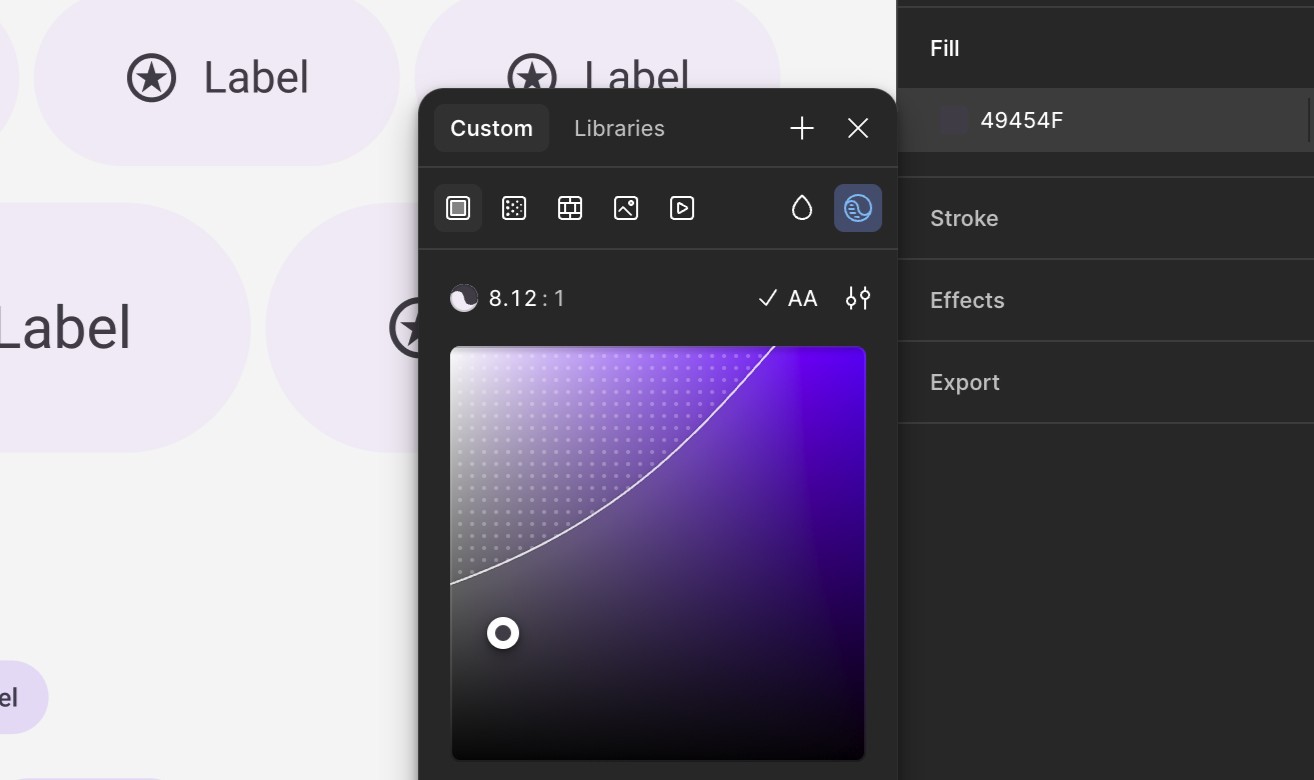
Figma - Built-in Colour Picker Contrast Menu
Rating: 3.0/5 Pricing: Free Checking: Manual only
Provides node-level contrast checking with WCAG AA and AAA compliance feedback. The visual colour area helps you quickly find passing combinations.
What we like: The colour adjustment UI make finding compliant colours easy. It's already in the colour picker tool.
What could be better: ACPA support. Background colour detection is spotty.
Best for: Quick, straightforward checks on any designs. Not suitable for design system work or complex nested structures.
A11y - Colour Contrast Checker
Rating: 2.8/5 Pricing: Free Checking: Manual only
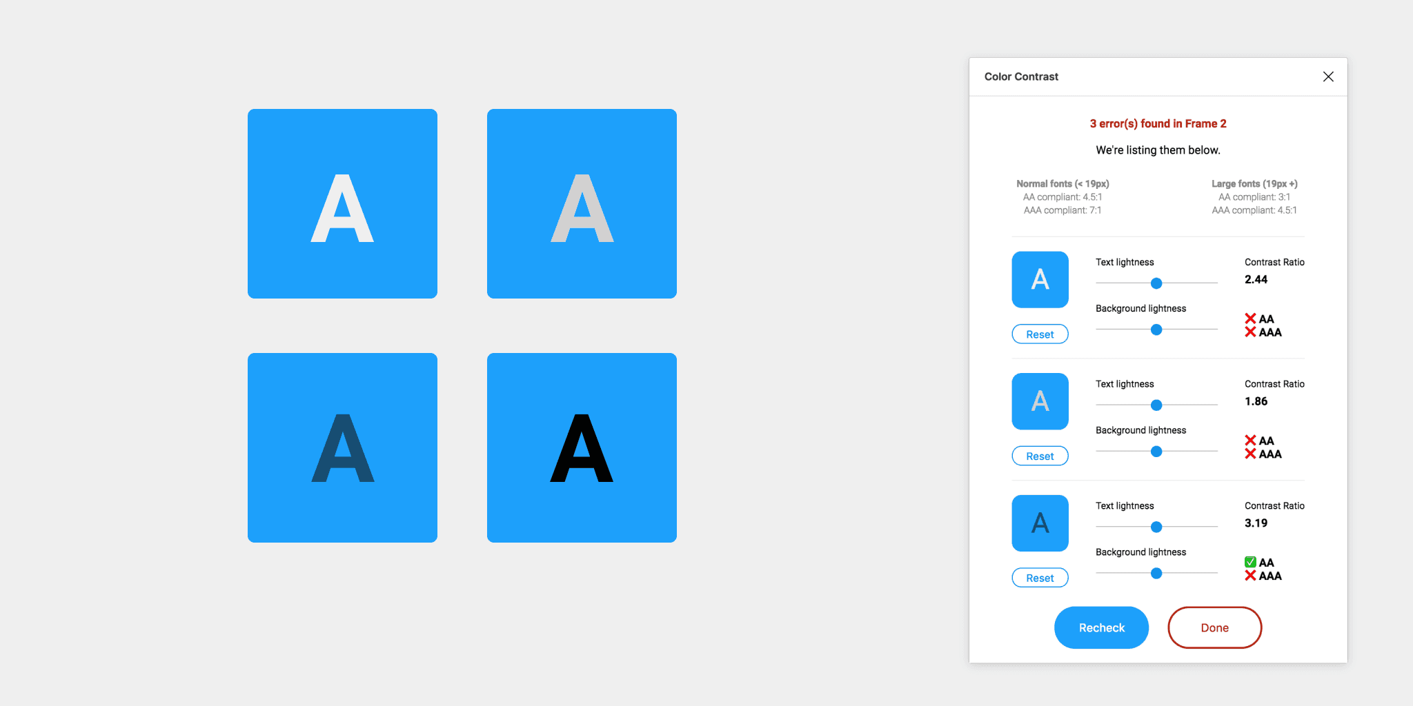
This plugin provides frame-level contrast checking with WCAG AA and AAA compliance feedback. The colour sliders help you find passing combinations quickly, which is genuinely useful when you're iterating on colour choices.
However, the plugin hasn't been updated since January 2020. That's over five years of dormancy. It doesn't support sections, components, or instances, and it struggles with complex layer structures. You're working with legacy software here.
What we like: The colour adjustment sliders make finding compliant alternatives straightforward. Microsoft's design pedigree shows in the interface.
What could be better: Component and instance support would make this far more practical. The five-year silence on updates is concerning.
Best for: Quick, straightforward checks on simple designs. Not suitable for design system work or complex nested structures.
Able – Friction Free Accessibility
Rating: 3.0/5 Pricing: Free Checking: Manual only
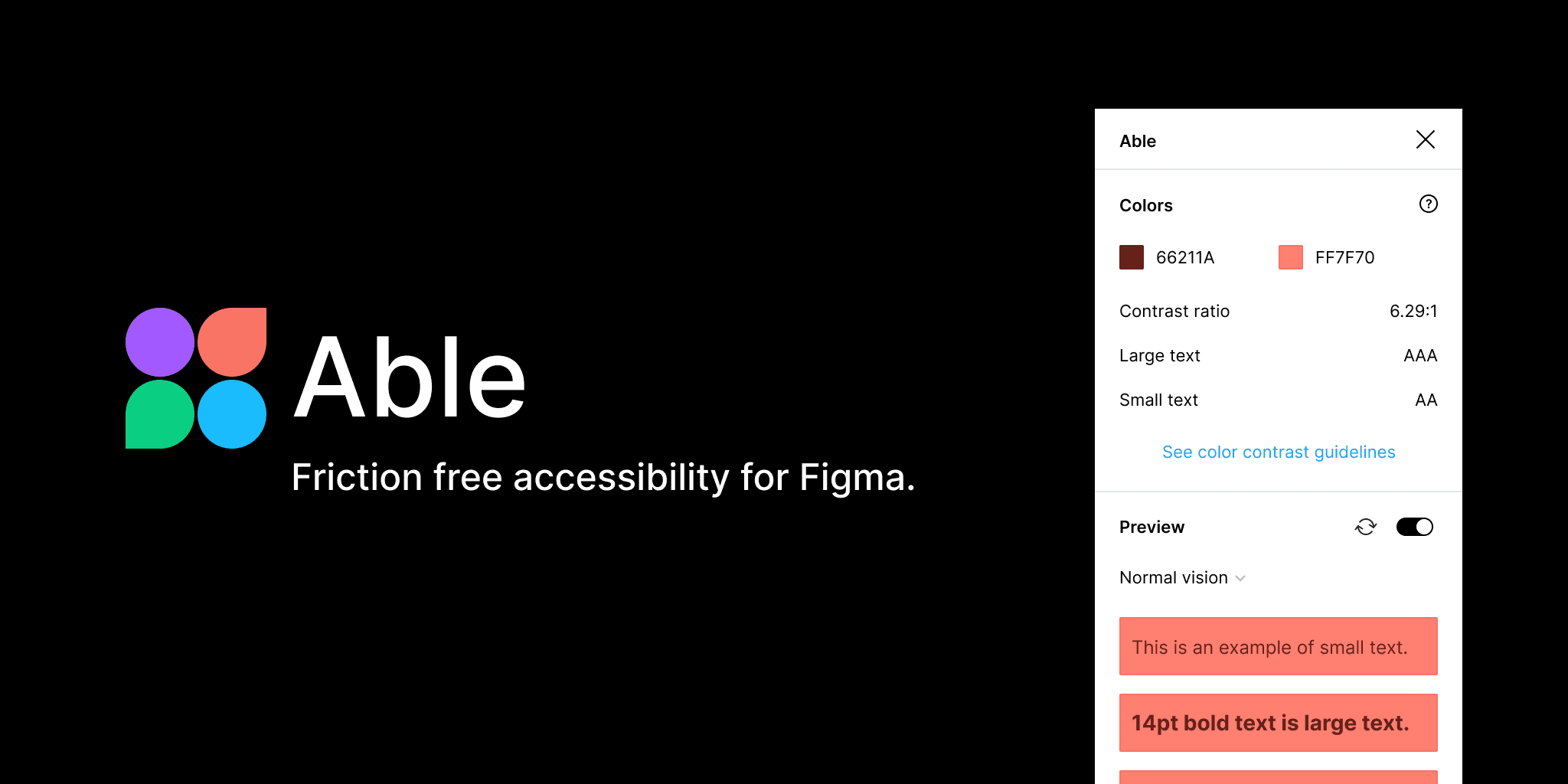
Able does one thing exceptionally well: two-layer comparison. Select your foreground and background, and it updates in real time. The colour blindness simulation adds genuinely useful context, showing you how your choices affect people with different types of colour vision.
The plugin hasn't been updated in over five years, which creates some risk for the future. There's no batch checking, no component support, and no instance support.
What we like: The real-time updating feels responsive and natural. Colour blindness simulation is thoughtfully integrated. Zero friction for quick checks.
What could be better: Support for components and instances would transform this from a spot-check tool into something you could use systematically. Active maintenance would be reassuring.
Best for: Designers who want quick spot-checks without complexity. Perfect as a secondary tool alongside something more comprehensive.
Accessibility Assistant (Microsoft)
Rating: 2.0/5 Pricing: Free Checking: Manual only
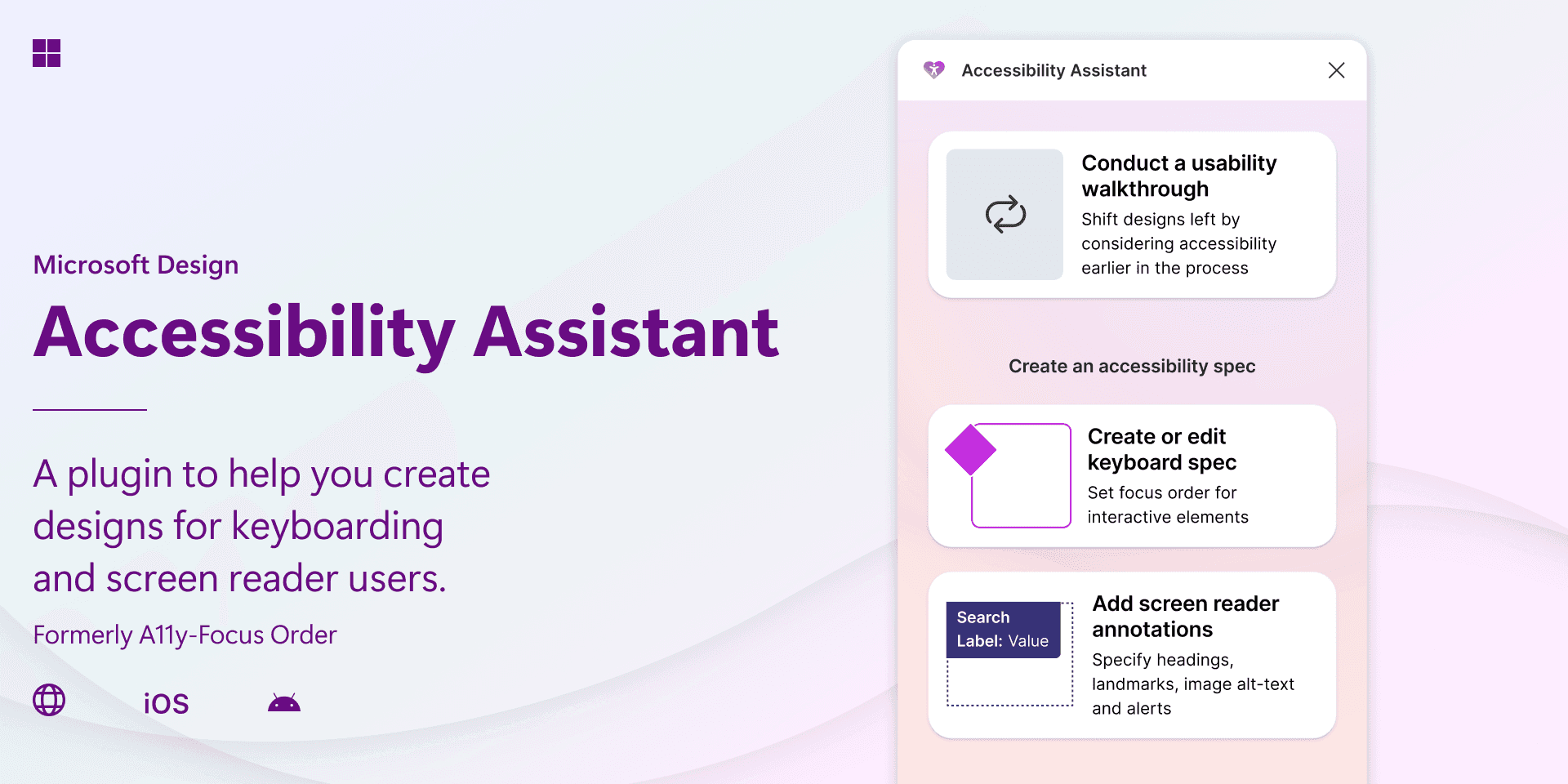
A recently updated Microsoft plugin that's worth keeping an eye on. The January 2026 update suggests renewed investment after a long period of quiet, though it's too early to know whether this signals sustained development or a one-off refresh.
What we like: Active maintenance is a positive sign. Microsoft's backing provides some confidence in longevity.
What could be better: Feature set remains limited compared to alternatives. Needs time to prove itself.
Best for: Those who prefer Microsoft tools and want to monitor how this develops. Not yet a primary recommendation.

Adee - Accessibility Tools, Contrast Check
Rating: 3.8/5 Pricing: Free Checking: Bulk and manual
A newer entrant with full component, section, and instance support. The November 2025 update date suggests active development, and bulk checking capability makes it practical for design system work. This is separate from the "Adee Comprehensive Accessibility Tool" (which doesn't work properly).
The smaller user base means less community validation, but the features are solid for a free tool.
What we like: Bulk checking across components and instances works reliably. Active development is encouraging. Touch target size checking is a useful addition.
What could be better: No icon detection. No canvas export for results. The lower user count means fewer people stress-testing edge cases.
Best for: Design system work where you need to check contrast across variants and states. A strong free alternative to paid options for systematic checking.
axe for Designers (Deque Systems)
Rating: 1.5/5 Pricing: Free Checking: Bulk and manual
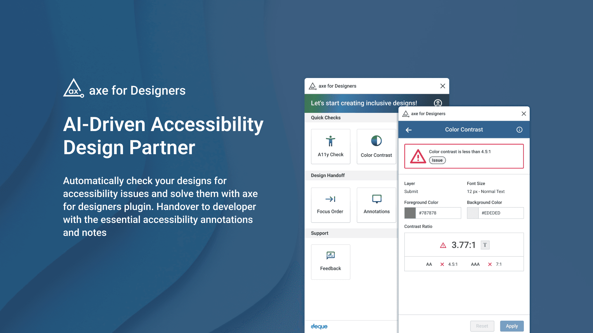
This one is disappointing. Deque makes excellent developer tools, and axe is a respected name in accessibility testing. Their Figma plugin, however, shows significant inaccuracies in colour detection. It frequently grabs the wrong colours from layers, forcing you into manual colour picking, which defeats the purpose entirely.
Component, section, and instance support exists on paper but operates unreliably in practice.
What we like: The concept is sound, and Deque's reputation suggests they could fix this.
What could be better: Colour detection accuracy is the fundamental job of a contrast checker. Getting this wrong undermines everything else.
Best for: Nobody, currently. Wait for significant updates before considering this. The Figma plugin needs substantial work before it matches the quality of Deque's other products.
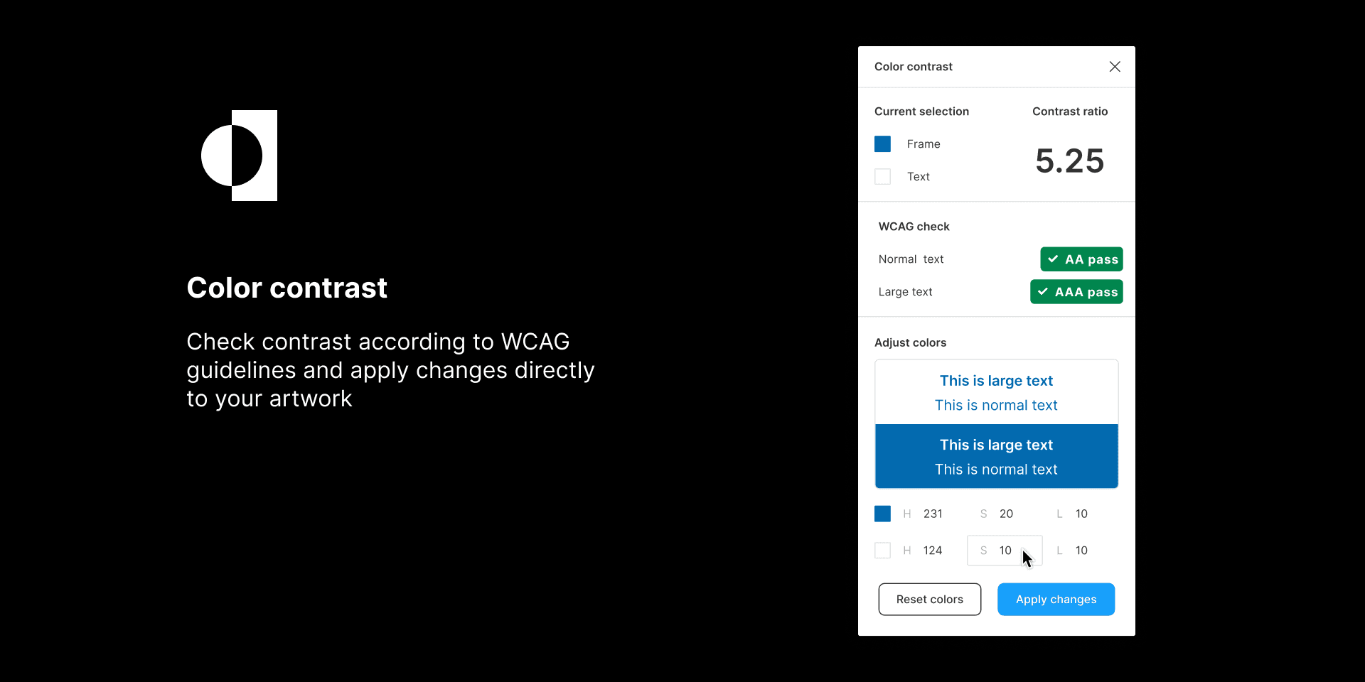
Colour Contrast (Aleksandra Walczak)
Rating: 3.0/5 Pricing: Free Checking: Manual only
A straightforward contrast checker that does what it says. Select two colours, get a contrast ratio. Reliable for basic checks without any complications.
No component support, no batch checking, and over three years without updates. The simplicity is both its strength and its limitation.
What we like: Does the basics reliably. No learning curve.
What could be better: Component and instance support. Some sign of active maintenance.
Best for: Beginners who want something uncomplicated. Quickly outgrown once you're working with components or need systematic checking.
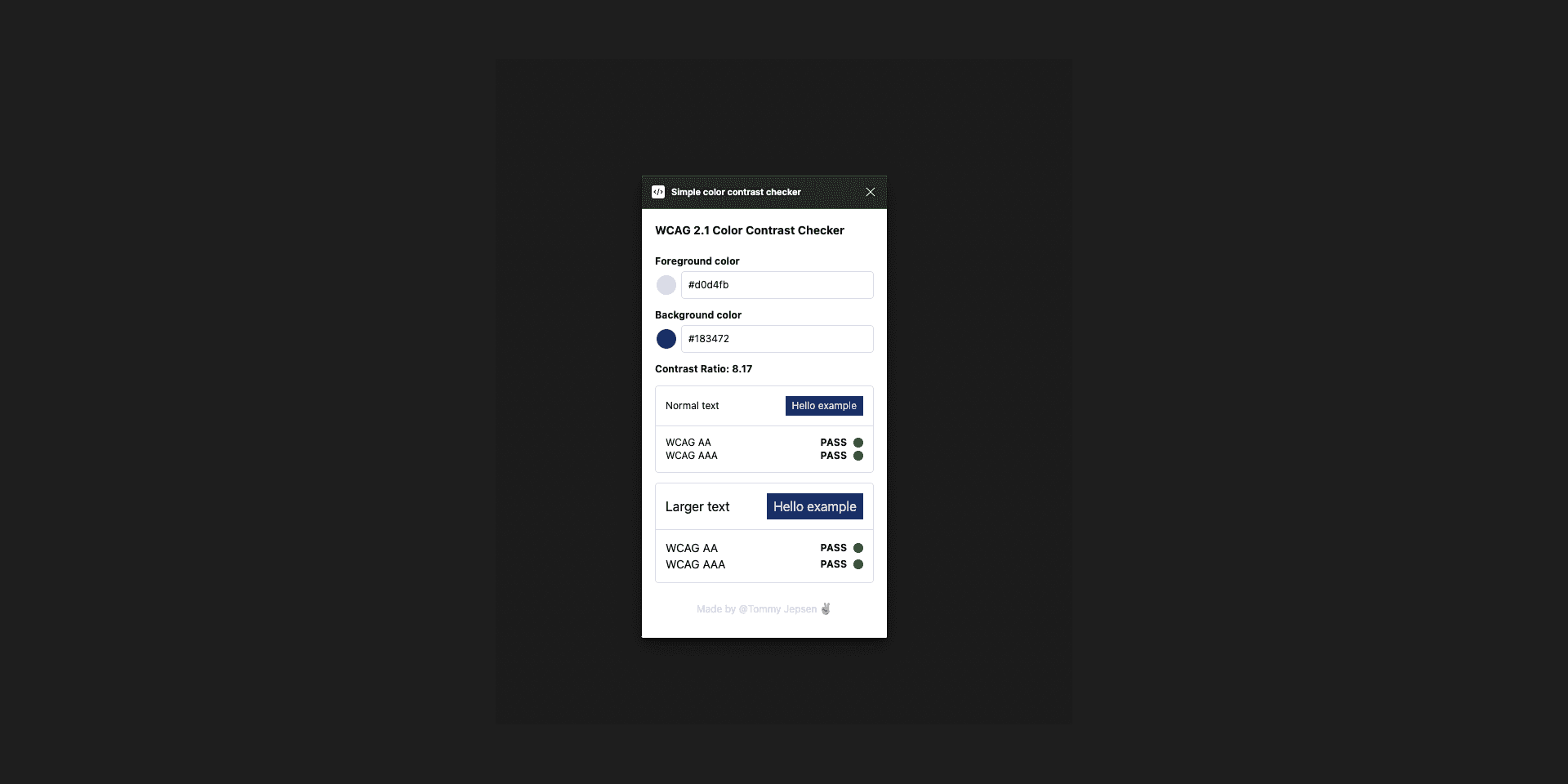
Colour Contrast Checker WCAG 2.1 (Tommy Jepsen)
Rating: 2.5/5 Pricing: Free Checking: Manual only
Another basic option focused specifically on WCAG 2.1 compliance. Handles the fundamentals without any distinguishing features.
What we like: WCAG 2.1 focus is clear and accurate.
What could be better: Nothing sets this apart from better alternatives. Consider the WillowTree plugin instead for more capability at the same price (free).
Best for: Those who want something minimal. Most designers would be better served by Contrast (WillowTree).
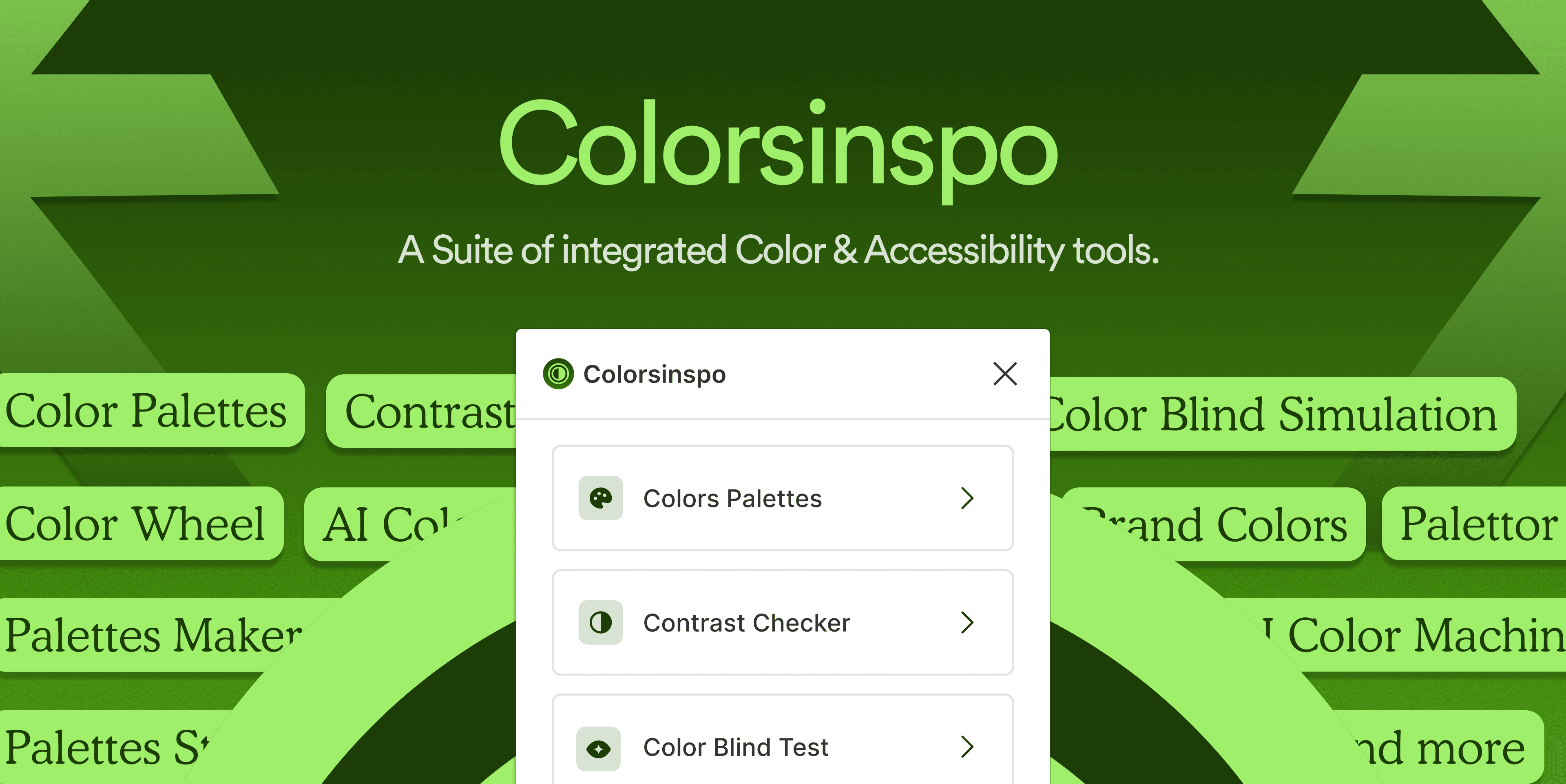
Colour Palettes / Colorsinspo
Rating: 2.5/5 Pricing: Free Checking: Manual only
This is primarily a colour palette generation tool rather than a dedicated contrast checker. It appears in contrast-related searches because it includes some contrast functionality, but that's not its focus.
What we like: Useful for generating harmonious palettes. The contrast features work as a bonus.
What could be better: If you need serious contrast checking, this isn't the tool.
Best for: Designers looking for palette generation who occasionally want to check contrast. Not a replacement for dedicated contrast checking.
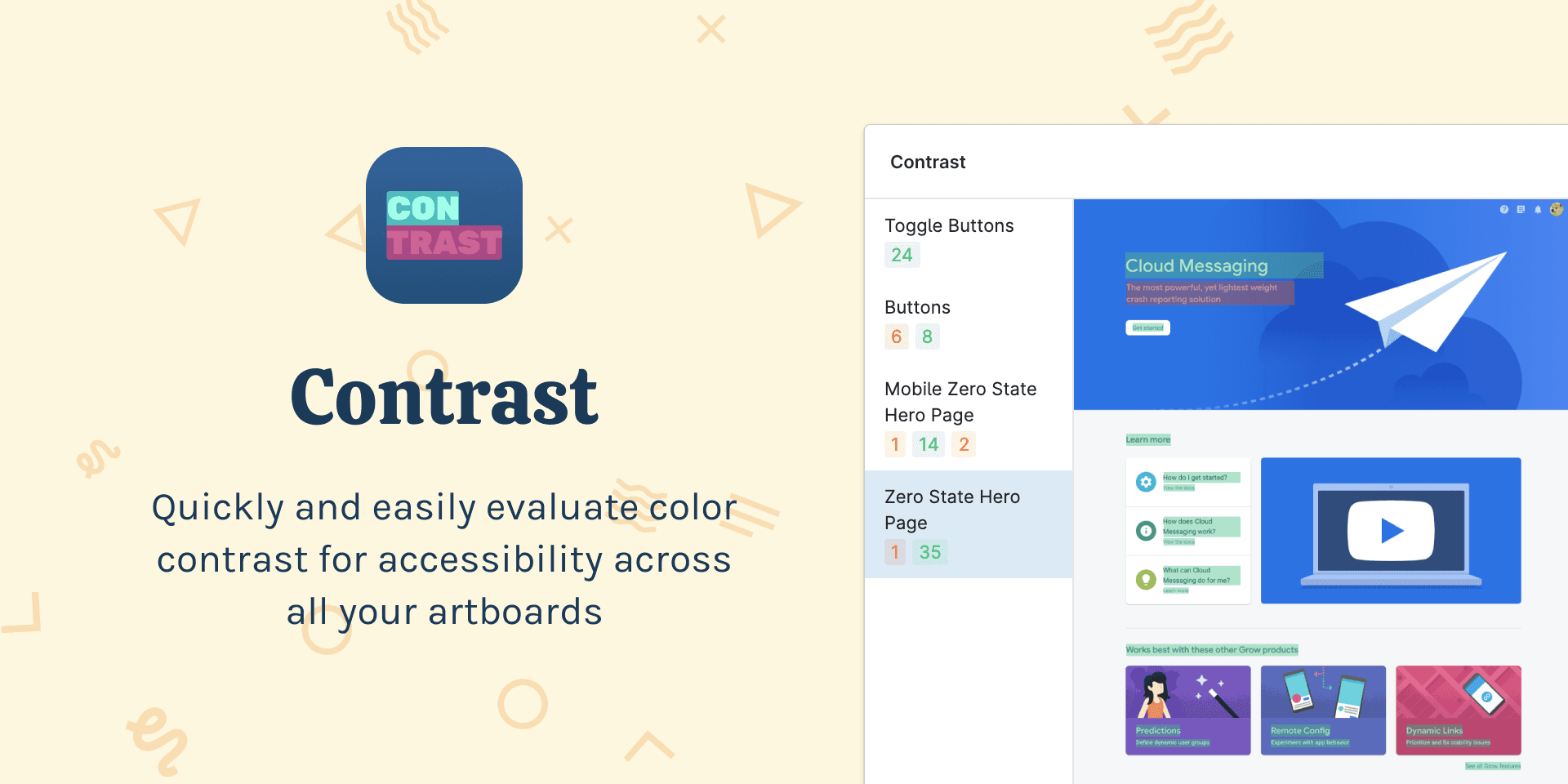
Contrast (Roman Nurik)
Rating: 3.5/5 Pricing: Free Checking: Bulk and manual
A solid free option with component, section, and instance support. The plugin handles bulk checks and feels lightweight and fast in use. A totally unique interface for quickly reviewing constrast ratios at a glance.
The plugin hasn't been updated since late 2023, which creates some dormancy risk. No icon detection, and the future maintenance situation is unclear.
What we like: Bulk checking with component support in a free tool is valuable. The interface is unique.
What could be better: Active maintenance would provide confidence. Icon detection would be welcome. A way to navigate the plugin with a keyboard would be more accessible.
Best for: A nice little alternative to WillowTree's Contrast plugin. Watch for whether updates resume before committing to it as your primary tool.
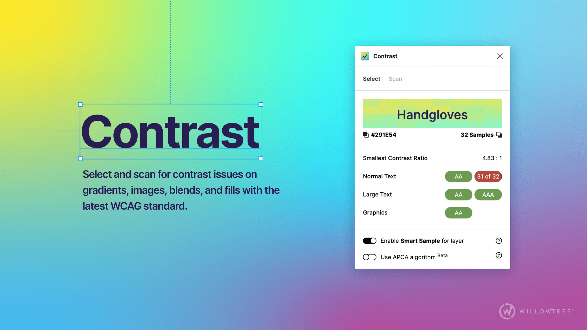
Contrast (WillowTree)
Rating: 3.8/5 Pricing: Free Checking: Bulk and manual
Our top free recommendation. Contrast by WillowTree offers robust features without any cost. It supports components, sections, and instances. It handles bulk checks. Active maintenance (last updated January 2025) means you can trust it won't break unexpectedly.
What we like: Everything most designers need in a free tool. Bulk checking, component support, instance support, active development. The combination is rare.
What could be better: I wish it showed you the contrast ratio test result values in the bulk scan mode.
Best for: Most designers. Install this first. It covers quick contrast checking needs without costing you a thing.
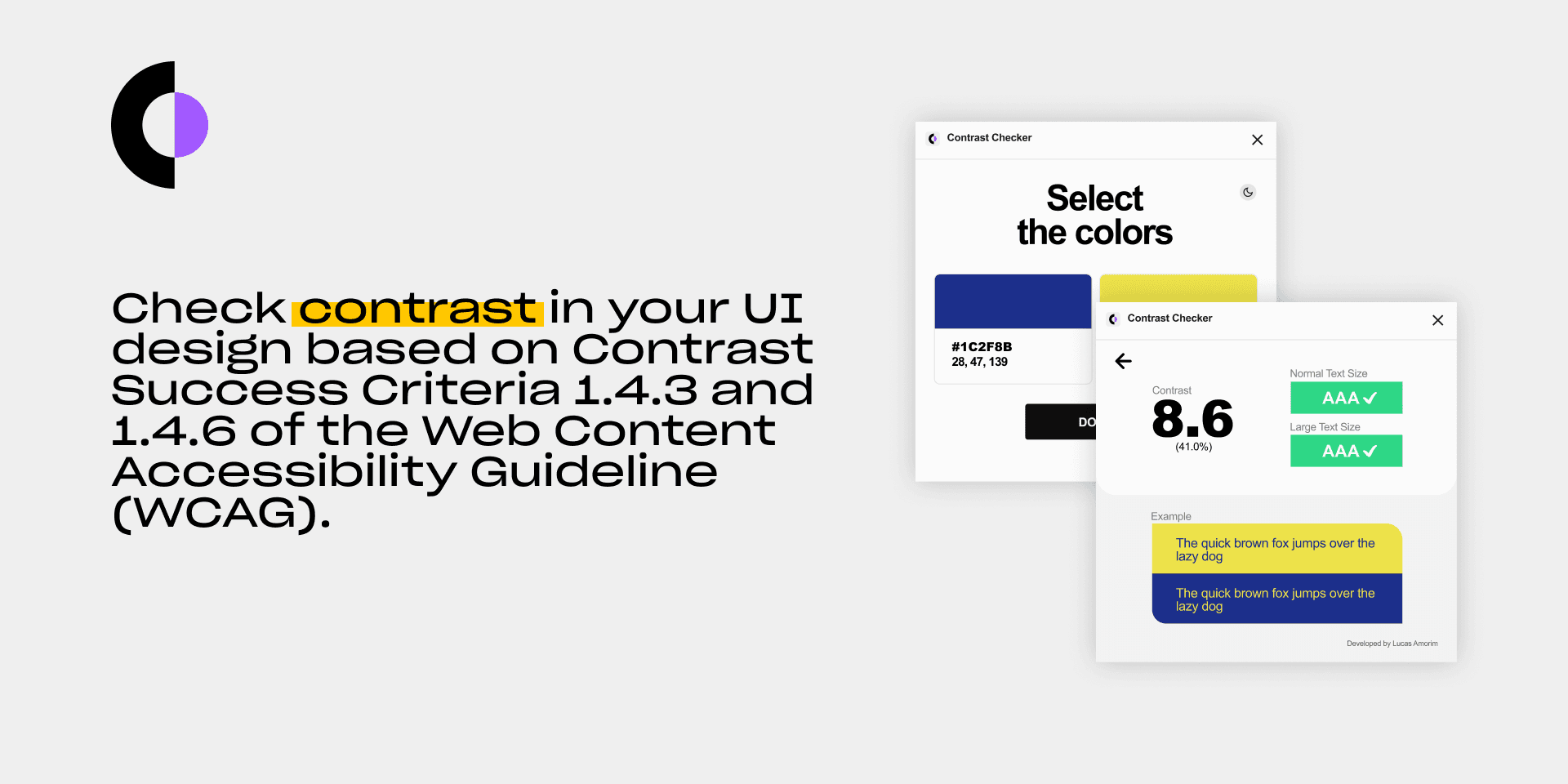
Contrast Checker (Lucas Amorim)
Rating: 3.0/5 Pricing: Free Checking: Manual only
Basic contrast checking without component, section, or instance support. Functions reliably for straightforward checks without any distinctive features.
What we like: Works as expected. No surprises.
What could be better: Component support would make this more practical. Nothing distinguishes it from alternatives.
Best for: Quick manual checks when you don't need systematic coverage.
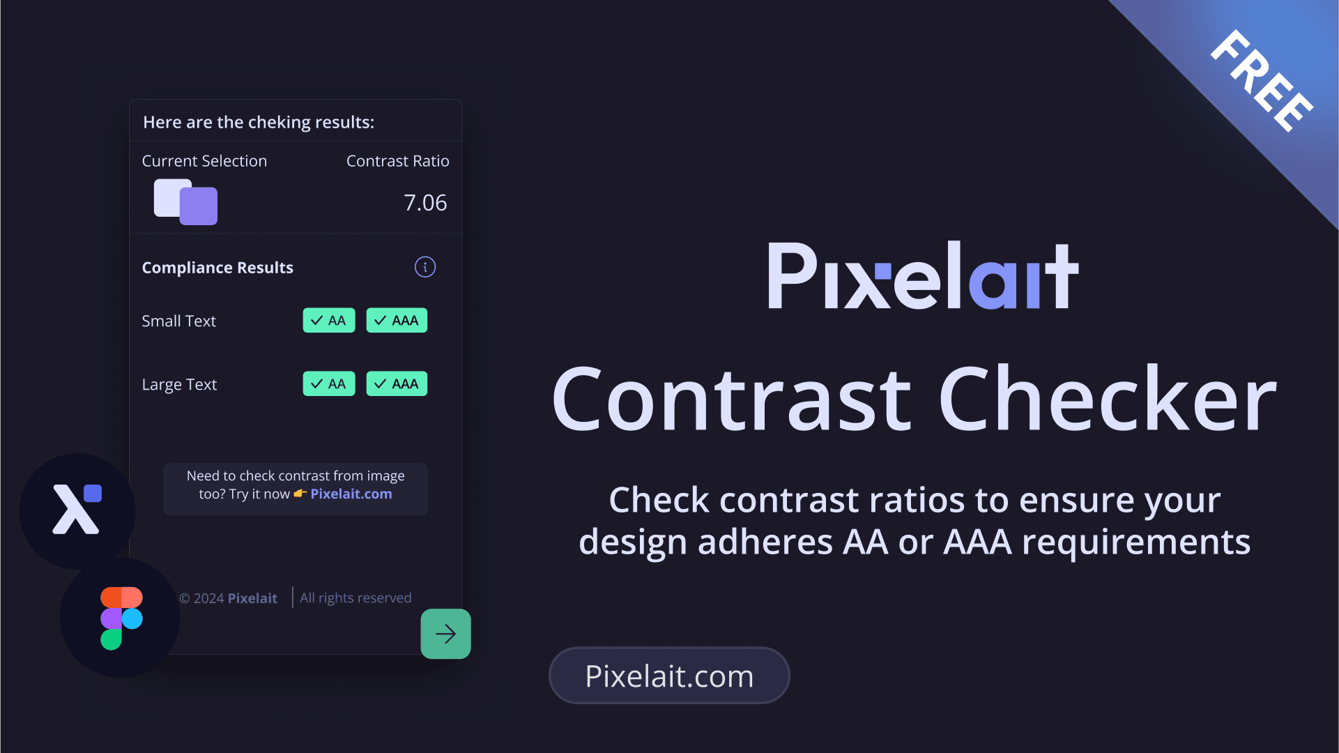
Contrast Checker (Pixelait)
Rating: 2.5/5 Pricing: Free Checking: Manual only
A very small user base but recently updated in January 2025. This suggests active development, though the limited community means less real-world testing.
What we like: Recent updates indicate the developer is engaged.
What could be better: The small user base means fewer edge cases have been discovered and fixed. Too early to recommend confidently.
Best for: Those willing to try emerging tools. Monitor this one if you're curious, but established alternatives are safer choices for production work.
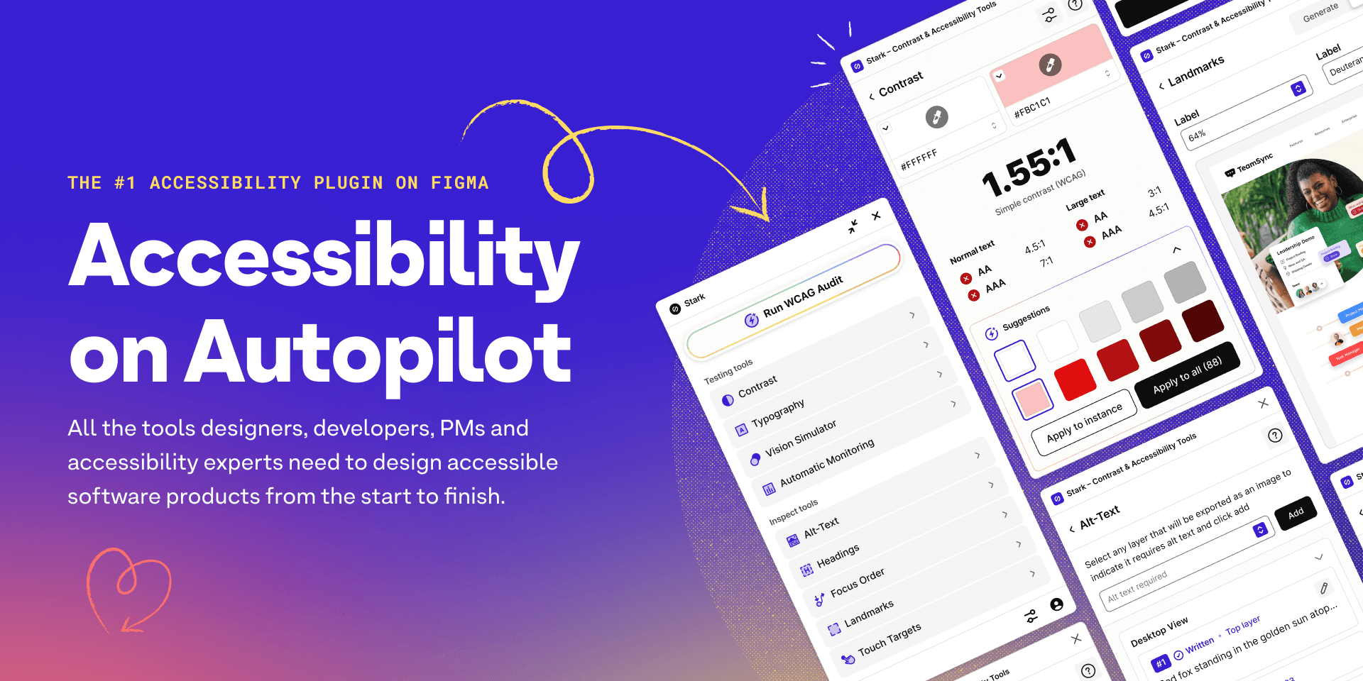
Stark
Rating: 4.9/5
Pricing: Individual from £160/year, Teams from £2,000/year (limited free tier) Checking: Bulk and manual
Stark offers the most comprehensive accessibility suite available. It handles contrast checking alongside focus order, landmarks, alt-text, touch target sizes, and more. Automated suggestions for fixing issues save time when you're working at scale. Design system integration means component-level checking works smoothly.
The free tier is now extremely limited. Essentially every feature is reserved for paying users, save for the manual colour picker. If you're not paying, you're getting a fraction of the tool's capability.
What we like: The feature set is unmatched. APCA support for WCAG 3.0 readiness. Compliance reporting for VPAT generation. Automatic monitoring. The investment shows.
What could be better: The pricing is significant. At £160/year for individuals and £2,000+ for teams, you need to be certain you'll use the advanced features. The free tier feels more like a demo than a functional tool.
Best for: Teams with budget who need compliance documentation, batch processing at scale, or VPAT generation. If you're paying, it's the market leader. If you're not, the free alternatives cover standard contrast checking adequately.
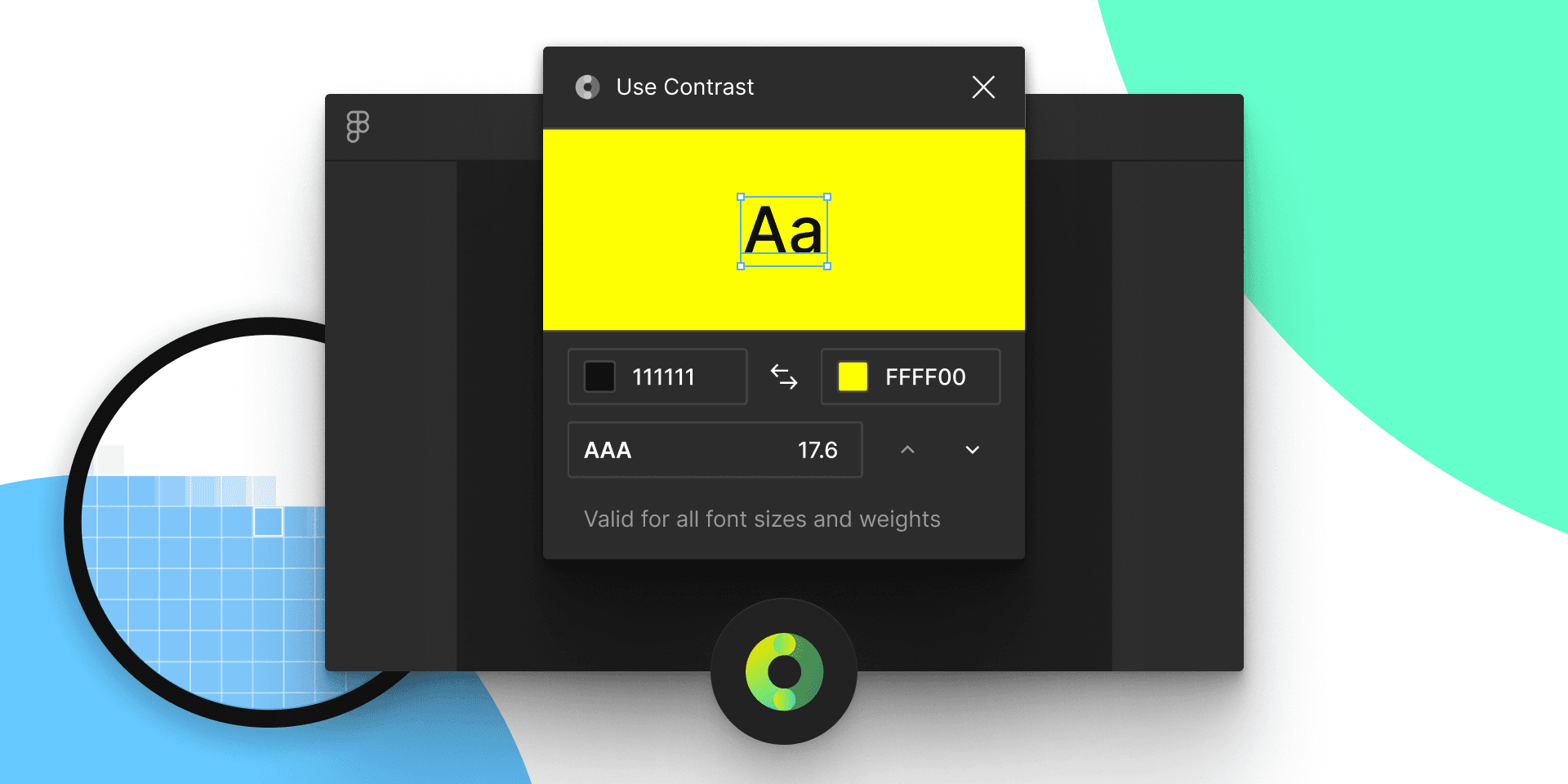
Use Contrast
Rating: 2.0/5 Pricing: Free Checking: Manual only
Functional but dormant. No component support. Over three years without updates creates reliability concerns for the future.
What we like: Works today for basic checks.
What could be better: Active maintenance. Component and instance support.
Best for: Not recommended. Other options offer better long-term stability with equivalent or superior features.
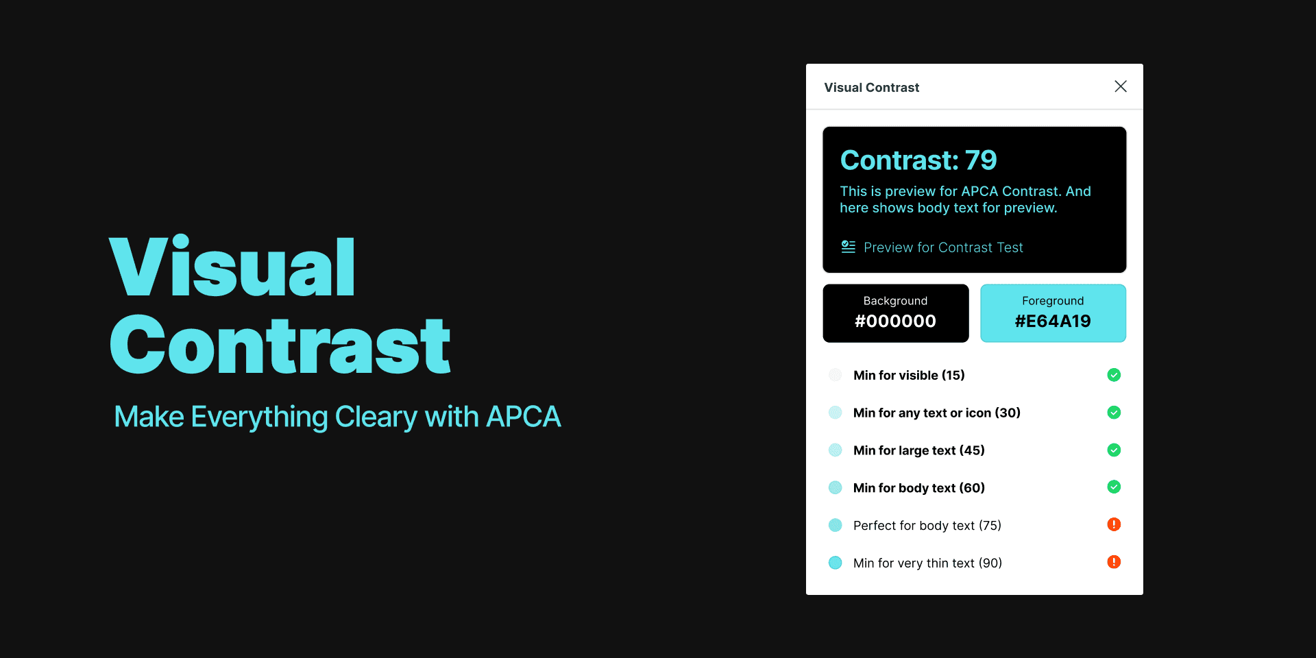
Visual Contrast: Everything Clearly with APCA
Rating: 2.8/5 Pricing: Free Checking: Manual only
This plugin serves a specific purpose: APCA (Accessible Perceptual Contrast Algorithm) calculations for WCAG 3.0 readiness. If that's what you need, it delivers accurately.
Small user base. No component support. Dormant development.
What we like: APCA calculations are accurate and clearly presented. Future-proofing for WCAG 3.0.
What could be better: Component support. Active maintenance. Broader feature set for those who want APCA alongside traditional WCAG checking.
Best for: Designers specifically seeking APCA calculations to understand how designs will perform under WCAG 3.0. Not a general-purpose tool.

Adee Comprehensive Accessibility Tool
Rating: 3.4/5 Pricing: Free Checking: Unusable
Despite the "comprehensive" branding, this plugin fails to function reliably. During testing, it failed to launch properly and did not detect colours accurately. Don't confuse this with "Adee - Accessibility Tools, Contrast Check" (reviewed above), which comes from the same developer but works correctly.
Best for: Nobody. Avoid. Don't waste time troubleshooting.
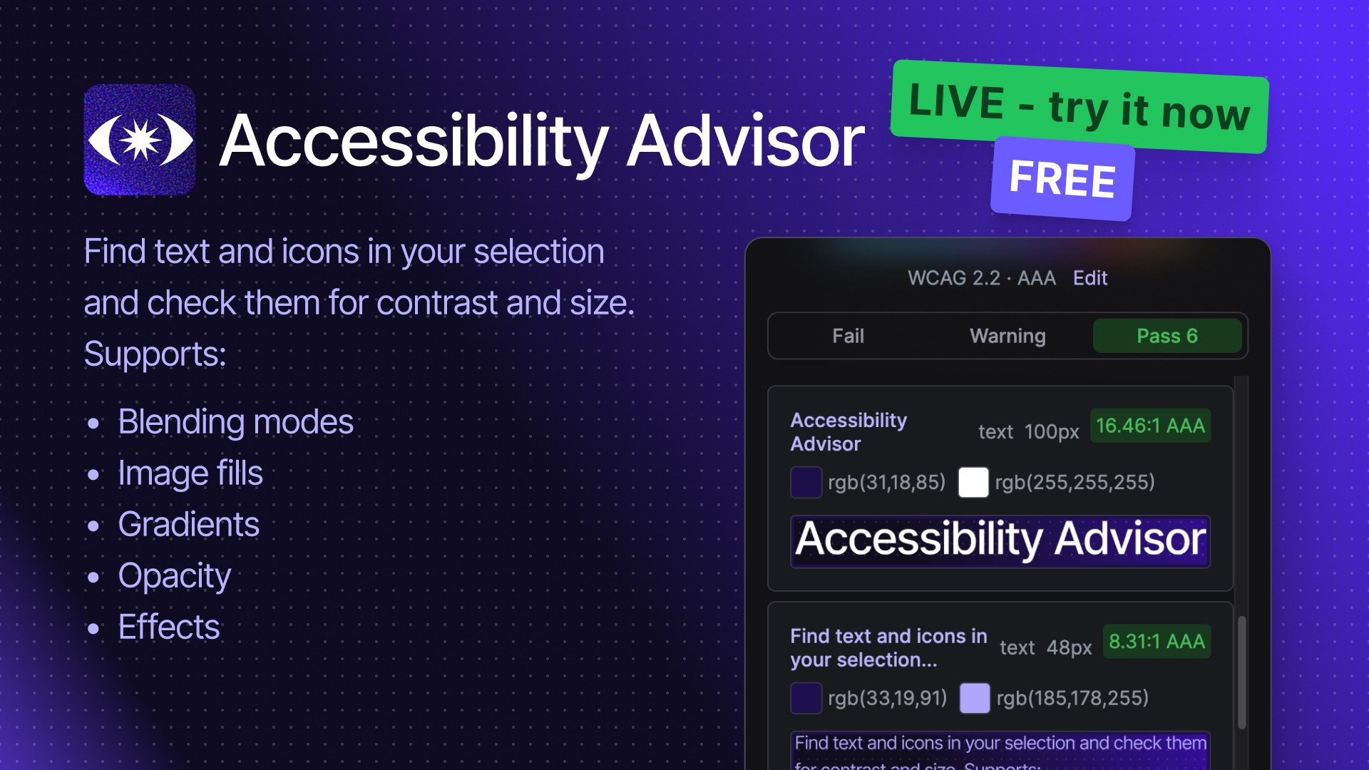
Accessibility Advisor
Rating: 0/5 Pricing: Free / Pro is £39.99 /yr or £3.99/mth Checking: Bulk only
Despite being our own accessibility plugin, it’s worth being clear about what it is (and isn’t): it’s a fast pre-handoff checker, not a replacement for proper QA with real content, real devices, and real assistive tech.
Select your layers and run a scan and it’ll detect text and icons, measure colour contrast and size, then flag pass / fail / warning against WCAG 2.0, 2.1, and 2.2 at AA/AAA so you can fix issues before handoff. Where other tools fall over on messy UI (gradients, image fills, opacity, blending modes, patterns, and effects), it uses dominant colour detection so contrast is calculated from the closest reference point to what users actually perceive - not just the first solid fill it can find.
Best for: design systems, audit-style sweeps, and catching obvious failures early. Just don’t treat a “pass” as a compliance certificate: edge cases (like complex imagery, anti-aliasing, and dynamic states) still need human review and testing in implementation.
Key takeaways
If You're an Individual Designer
Install Contrast by WillowTree for your daily work. It handles everything most designers need without cost. Keep Able installed as well for quick two-layer checks when you want something even simpler.
Don't pay for Stark unless you specifically need compliance reporting or VPAT generation. The free alternatives cover standard contrast checking well.
If You're Working with Design Systems
Prioritise plugins that support components and instances. You'll want to check contrast across variants and states without manually selecting each one.
Contrast by WillowTree and Contrast by Roman Nurik are your best free options here. Both handle components, sections, and instances properly. If budget allows and you need batch processing at scale, Stark Pro delivers, but the cost is significant.
If You're Building for WCAG 3.0
Install Visual Contrast: Everything clearly with APCA alongside your primary contrast checker. APCA gives you a sense of how your designs will perform under the forthcoming standard.
Keep an eye on when WCAG 3.0 officially launches. The transition will likely take years, but understanding APCA now means you won't face a scramble when it becomes the new baseline.
Watch Out For
Dormant plugins: Anything not updated since 2022 could break with future Figma releases. The platform evolves, and unmaintained plugins eventually fall behind.
Broken plugins: Don't waste time trying to make Adee Comprehensive or axe for Designers work reliably. We tried. They don't.
Paywall creep: Features you relied upon may move behind subscriptions. This happened with Stark and could happen with other tools. Having alternatives installed means you're not caught out.
Sources and further reading
Accessibility by Zach Bogart from Noun Project (CC BY 3.0)
Relevant articles
Need a Product Designer?
Get in touch with me for a no-obligation chat about your project.